
Description
/* — RESET & FULL WIDTH HACK — */
.rz9-wrapper {
/* Forces full viewport width, breaking out of theme container */
width: 100vw;
position: relative;
left: 50%;
right: 50%;
margin-left: -50vw;
margin-right: -50vw;
box-sizing: border-box;
font-family: Inter, system-ui, -apple-system, sans-serif;
color: #1a1a1a;
line-height: 1.6;
background-color: #ffffff;
overflow-x: hidden;
}
.rz9-wrapper *, .rz9-wrapper *::before, .rz9-wrapper *::after {
box-sizing: border-box;
}
.rz9-wrapper img {
max-width: 100%;
height: auto;
display: block;
margin: 0 auto;
}
/* — INNER CONTAINER (Max width for large screens) — */
.rz9-container {
max-width: 1100px;
margin: 0 auto;
/* No extra padding needed here as sections handle it now */
}
/* — HERO SECTION — */
.k2m-hero {
background: linear-gradient(180deg, #f8f9fa 0%, #ffffff 100%);
/* Halka Padding added here (15px sides) */
padding: 30px 15px;
text-align: center;
width: 100%;
}
.k2m-hero h1 {
font-size: 28px;
font-weight: 800;
margin: 15px 0;
line-height: 1.2;
color: #111;
}
.k2m-hero p {
font-size: 16px;
color: #666;
margin: 0 auto 20px;
max-width: 600px;
}
.x7b-badge {
background: #e0f2f1;
color: #00695c;
padding: 6px 14px;
border-radius: 50px;
font-weight: 700;
font-size: 12px;
text-transform: uppercase;
display: inline-block;
}
/* Rounded Image on mobile */
.w9z-hero-img {
width: 100%;
max-width: 900px;
border-radius: 16px; /* Round ho gaya */
margin-top: 20px;
box-shadow: 0 5px 15px rgba(0,0,0,0.05);
}
/* — FEATURES GRID — */
.j4p-grid-sect {
/* Halka Padding */
padding: 30px 15px;
background: #ffffff;
}
.j4p-grid-container {
display: flex;
flex-direction: column;
gap: 20px;
}
.q8v-card {
background: #f9fafb;
padding: 20px;
border-radius: 16px;
text-align: center;
border: 1px solid #eee;
width: 100%;
}
.q8v-card h3 { margin-top: 0; font-size: 20px; color: #111; font-weight: 700; }
.q8v-card p { font-size: 15px; color: #555; margin-bottom: 15px; }
.q8v-img { border-radius: 12px; width: 100%; max-height: 250px; object-fit: cover; }
/* — SPLIT SECTION — */
.m3x-split {
/* Halka Padding */
padding: 40px 15px;
background: #f8f9fa;
}
.m3x-inner {
display: flex;
flex-direction: column;
gap: 30px;
}
.m3x-txt h2 { font-size: 26px; font-weight: 800; margin-top: 0; color: #111; line-height: 1.2; margin-bottom: 20px;}
.m3x-list { list-style: none; padding: 0; margin: 0; }
.m3x-list li { margin-bottom: 15px; display: flex; align-items: center; font-size: 16px; color: #444; }
.m3x-icon { color: #10b981; margin-right: 12px; font-weight: bold; font-size: 18px; min-width: 24px; }
/* Rounded image on mobile */
.b2n-feat-img {
border-radius: 16px; /* Round ho gaya */
width: 100%;
}
/* — GALLERY — */
.g9l-gallery {
/* Halka Padding */
padding: 30px 15px;
}
.g9l-head { text-align: center; font-size: 24px; font-weight: 800; margin-bottom: 30px; }
.g9l-row {
display: grid;
grid-template-columns: 1fr 1fr;
gap: 10px; /* Increased gap slightly */
padding: 0;
}
.g9l-thumb {
width: 100%;
aspect-ratio: 1 / 1;
object-fit: cover;
border-radius: 12px; /* Round ho gaya */
}
/* — TABLE — */
.t5r-table-sect { padding: 40px 15px; background: #ffffff; }
.t5r-box {
border: 1px solid #e5e7eb;
border-radius: 16px;
padding: 15px;
overflow-x: auto;
-webkit-overflow-scrolling: touch;
width: 100%;
}
.t5r-table { width: 100%; min-width: 500px; border-collapse: collapse; }
.t5r-table th { background: #f9fafb; font-weight: 600; text-transform: uppercase; font-size: 12px; color: #666; letter-spacing: 1px;}
.t5r-table th, .t5r-table td { padding: 15px; text-align: left; border-bottom: 1px solid #eee; font-size: 15px; }
/* — CTA — */
.c8z-cta { text-align: center; padding: 50px 15px; background: #fafafa; border-top: 1px solid #eee; }
.c8z-final-img { max-width: 400px; width: 100%; border-radius: 16px; margin: 25px auto; display: block; }
/* — DESKTOP TWEAKS (Larger screens) — */
@media (min-width: 768px) {
.k2m-hero { padding: 60px 0; } /* Back to 0 on desktop if using container */
.j4p-grid-sect { padding: 50px 0; }
.m3x-split { padding: 60px 0; }
.g9l-gallery { padding: 50px 0; }
.g9l-row { grid-template-columns: repeat(4, 1fr); gap: 20px; }
.j4p-grid-container { flex-direction: row; }
.m3x-inner { flex-direction: row; align-items: center; }
.k2m-hero h1 { font-size: 48px; }
/* Re-apply container padding for desktop */
.rz9-container { padding: 0 20px; }
}
Stop Caging Them.
Start Protecting Them.
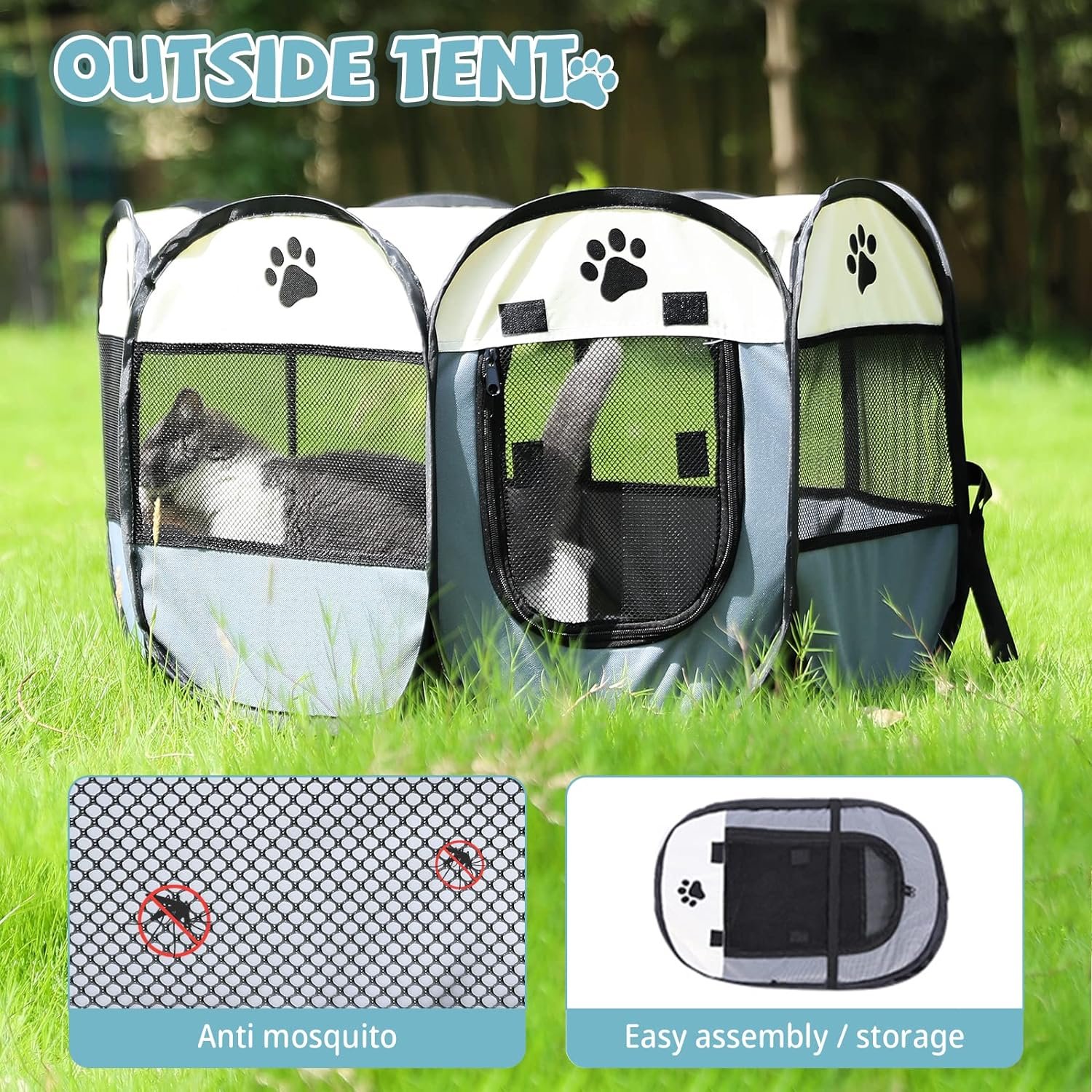
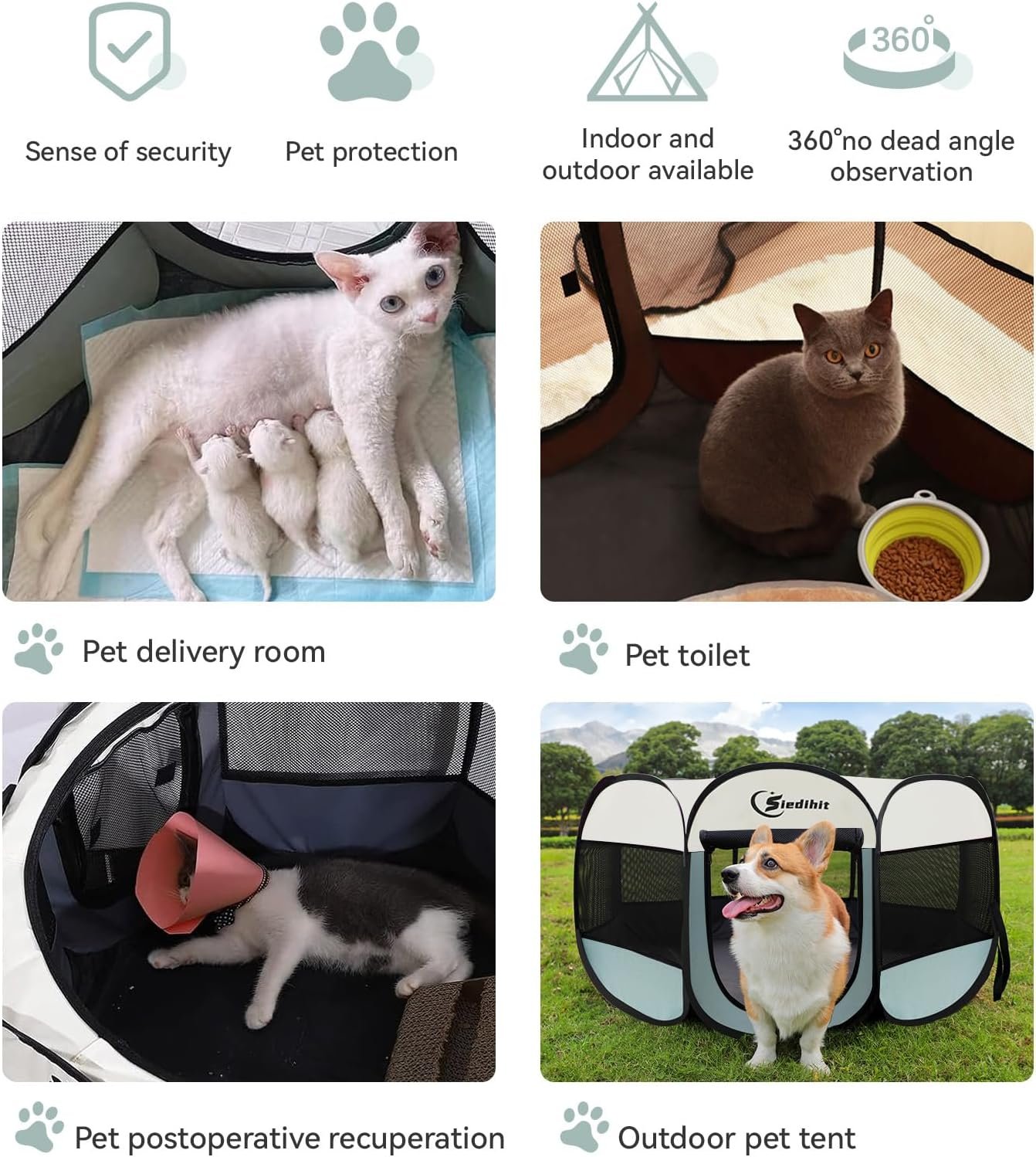
The instant “Pop-Up” safe haven for puppies, kittens, and rabbits. 5 seconds to setup. Zero stress.
🛡️ Panoramic View
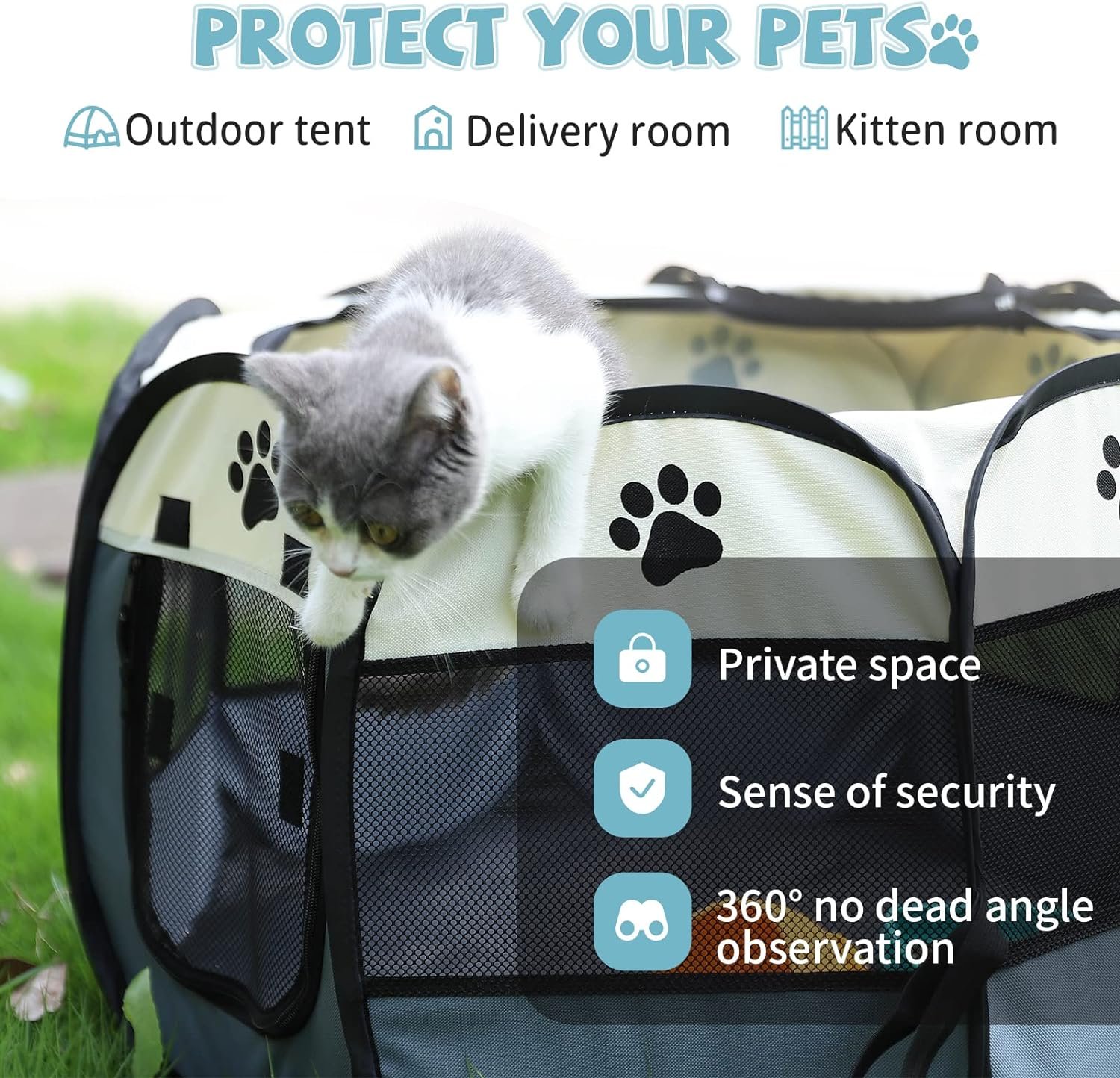
They see you, you see them. Anxiety-free design.
🚪 Easy Access
Roll-up zipper door allows for easy in-and-out freedom.
🚀 5-Sec Setup
Pops open instantly. No assembly needed.
Built Like a Tank.
Light as a Feather.
- 600D Oxford Cloth: Bite & scratch resistant.
- Waterproof Base: Accidents happen. Easy to clean.
- Convertible Roof: Removable mesh top for sun or shade.
Every Angle Covered 📸
Size Guide 📏
(Swipe table to view)
| Size | Dimensions | Weight Limit |
|---|---|---|
| Medium |
|
Up to 25 lbs |
| Large |
|
Up to 45 lbs |
Your Pet Deserves a Safe Space.
Join 50,000+ Happy Pet Parents in Pakistan.
⭐⭐⭐⭐⭐ 4.9/5 Rating


Reviews
There are no reviews yet.